The Neighborhood Project
A group of graphic designers showed their love for the Capital City this October with the completion of an unpaid project that created logos and other branding items for neighborhoods across Salt Lake City.
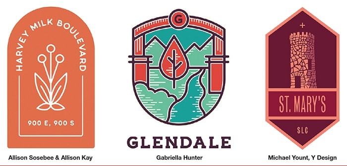
Dubbed The Neighborhood Project, participating designers were assigned a neighborhood at random—some actual designations, others unofficial nicknames—and asked to create a logo, poster, color palette, flag and swag item that represented the cultural and historical makeup of the area.
“We really wanted to do something fun with our design community,” says Jocelyn Kearl, owner of design firm Third Sun, which orchestrated the project alongside Coast to Coast Studio. “We wanted a project that was purely for the love of design and also had a strong connection to our city—that was our goal.”
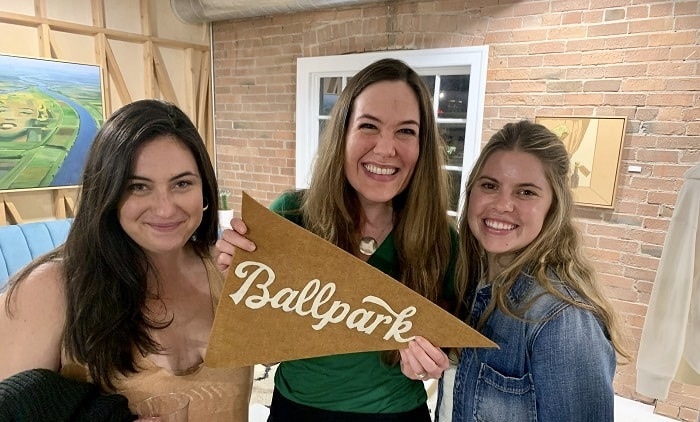
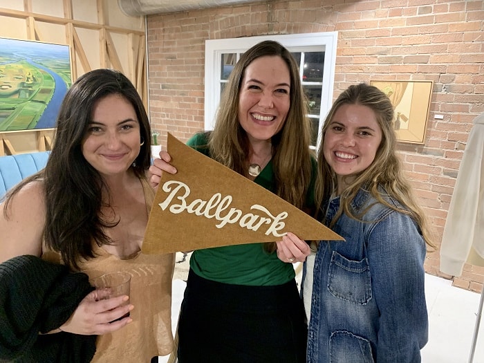
After six months of work, the designers presented their rebrands for 22 different neighborhoods across the city at the co-working and event space, The Foundry, during the annual Salt Lake Design Week.
“People really went all out,” says Michael Yount, designer behind Y Design and the mastermind behind the idea. “The fact that it was not for a specific client and not for a payment, it just was a true creative outlet and really tied to our community, I think that’s what got designers really excited about the project.”
From Swedetown and Sugar House to Capitol Hill and East Bench, the designs were as diverse as the neighborhoods themselves.
Yount designed a branding package for St. Mary’s neighborhood, named for the former 400-acre campus of St. Mary’s of Wasatch—a high school, convent and college at different points in history—which was built in 1926 and demolished in 1972. The last remaining landmark of the school is a stone tower that is now part of a modern residence in the neighborhood. Yount incorporated an illustration of the tower and drew inspirations from the stone’s colors to create the logo.
“Another cool byproduct of this project was really digging a bit to find out more about these neighborhoods,” says Yount. “The stories that the designers were able to find and then tell through their design was fascinating across the board.”
Salt Lake’s Hanko
Though the project was not a competition, attendees at the debut event did vote on a people’s choice award, which went to designer Alli VanKleeck of Hot Slice Design Studio for her branding of Japantown.
VanKleeck researched the neighborhood and traditional Japanese art and also put a call out on social media asking for feedback from Salt Lake City’s Japanese population. The end result was a logo inspired by the Hanko, a stamp used in Japanese culture in lieu of a signature. She reinterpreted the popular Japanese symbols of the cherry blossom and Mount Fuji through the lens of Salt Lake City, creating designs with the Sego Lily (Utah’s state flower) and outline of Mount Olympus in bold red and blue.
“In researching Salt Lake’s Japantown, I realized that it used to be this really cool thriving area and then urbanization made it smaller and smaller,” explains VanKleeck. “So after finding that out, I really want it to make sure that I did the culture and the history of it justice.”
Positive Reverberation
Since releasing the branding packages during Design Week, some local leaders have reached out to the designers to look into adopting the designs.
After a successful first year, The Neighborhood Project organizers hope to continue the design-for-the-sake-of-design tradition.
“We were totally overwhelmed by the response from the designers. We’re already talking about doing it again next year,” says Kearl. “There’s plenty more neighborhoods to do or maybe it will be a different theme connected to the area.”
The Neighborhood Project is currently exploring options for putting the designs on display for the public, but until then, many are available for viewing at here.
